Project 7 – Challenge
This week’s project was very interesting as we were given an assignment for self-guided exercise which meant no tutorial videos at all.
The challenge was – Meaningful place(s). We were free to draw as many or as little sketches as we wanted of places with some significance to us. It was very nice to see what other people came up with, and it’s interesting how you can get to know someone via their sketches.
I found project 7 quite sentimental as I was going through various places in my head. It almost felt like taking some inventory of places I’ve been to and meant something to me for various reasons.
I’ve decided to do each page in different style:

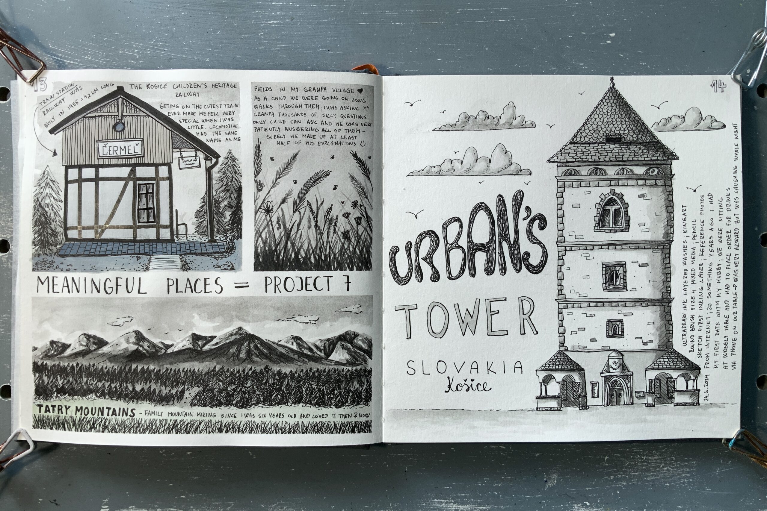
Page 1 – Little Child Memories
For this one, I had an idea how I wanted it to look and that idea went down the drain very soon after I started sketching as I was fighting the paper. Paper is good for all media except the water ones.
I wanted to do sketches in ink, which meant lots of layering. My sketches ended up to looking like one big mess I didn’t like at all.
I could not spread nor lift the ink the way I wanted. The worst came when I put multiple layers on the paper and saw it crumble into small pieces.
After being fairly creative and needing to salvage my page, I added pen work on top and accidentally a hint of yellow-green colour for Mountains. That happened by using the used, not properly rinsed, brush. To balance this “happy accident” as Bob Ross would say, I put a hint of Prussian blue to my train station to balance the page. After fiddling with this page for far too long, I was finally happy with the outcome.
Page 2 – Love Life Memory
I wanted this page to be very simple, and it ended up like a fairy tale castle, which I loved.
I used Ultradraw diluted ink in layers and had some fun with lettering as well. Spend some time with preliminary sketches with pencil to get the proportions correct. The paper quality did not matter that much for this sketch as there were no big spaces needed to be covered by ink wash, so the whole process went smoothly.

This week summary
- seeing other people’s sketches on Artkula, made me realised that people are living and visiting very interesting places
- sketch awesome journal paper is not good at all for watercolours nor for ink washes
- it was lovely to go down the memory lane
- any mistakes can be creatively incorporated into a design, it just takes time to figure out how 🙂
Affiliate Links Disclosure
This site uses affiliate links, which means that I earn a commission from qualifying purchases, at no extra cost to you, if you click on links that I recommend. I only recommend products I use myself.